Case studies
Our case studies demonstrate that we are a strategic and creative partner for Downtown West.
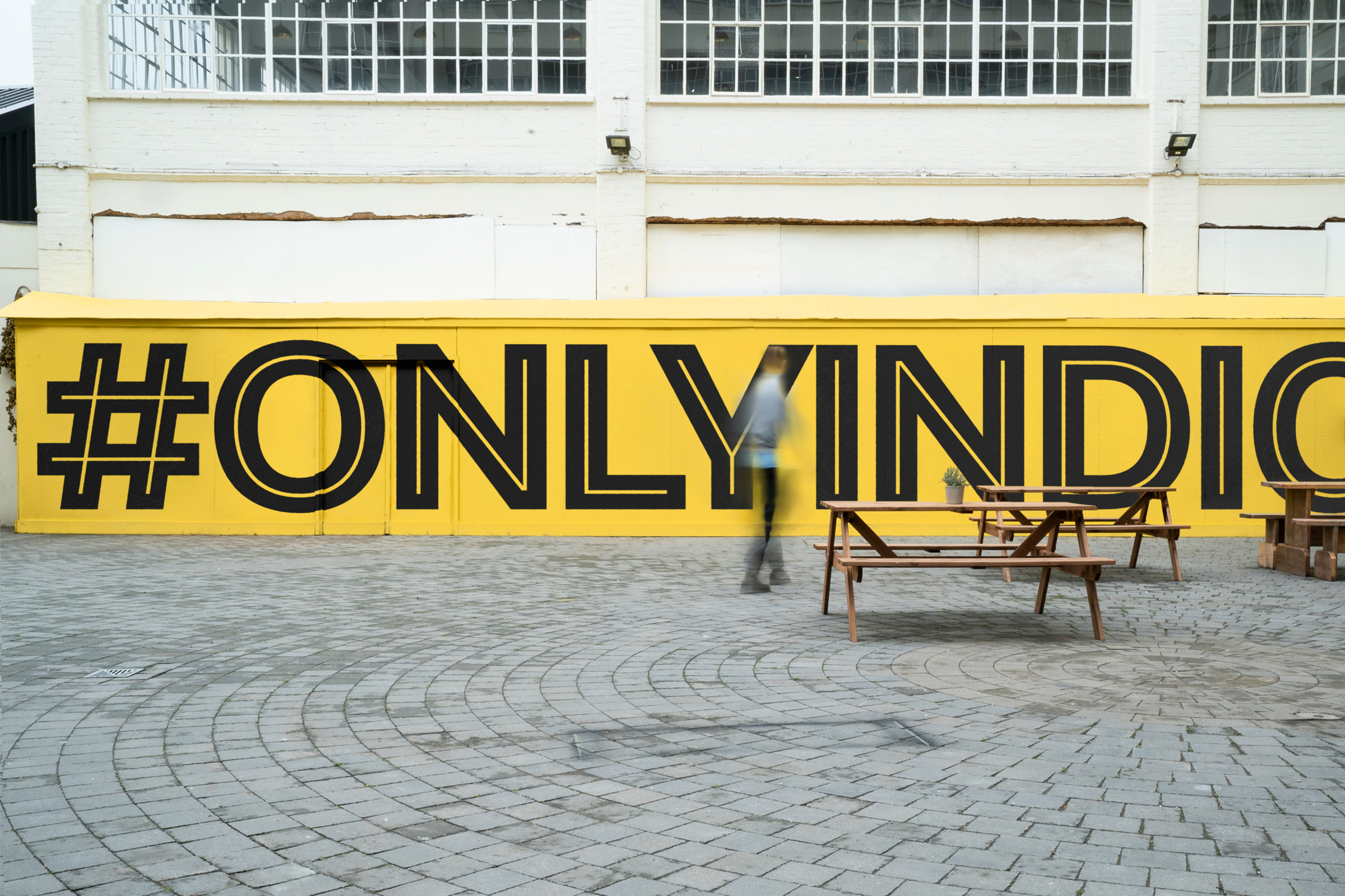
Pier 70
After years of disuse, this 35-acre site and former shipyard on the San Francisco bay is one of the city’s highest profile mixed-use redevelopments.
At the same time, San Francisco’s socio-political climate is dominated by stark contrasts between ‘tech-bro millionaire culture’ vs pervasive homelessness. We created a brand that was genuinely made of and for the city.
What we did
— Community research
— Brand strategy
— Visual identity
— Design & art direction
— Web design & development
— Films
— Wayfinding
Royal Docks
The Royal Docks is London's most important regeneration project, covering 1,200 acres and 12 miles of waterfront. But despite its proud past as the city's gateway to global trade, it was lost from many people's mental map of London. With the Mayor of London and Mayor of Newham, we created a brand to celebrate its nautical past and created a platform connecting the communities living and working around the docks.
What we did
— Community research
— Public consultation
— Brand strategy
— Visual identity
— Design & art direction
— Web design
— Content management
— Extensive editorial
— Social media strategy & execution
— Festival sub-branding
— Exhibition design
— Signage & wayfinding
— Local newspaper (in progress)
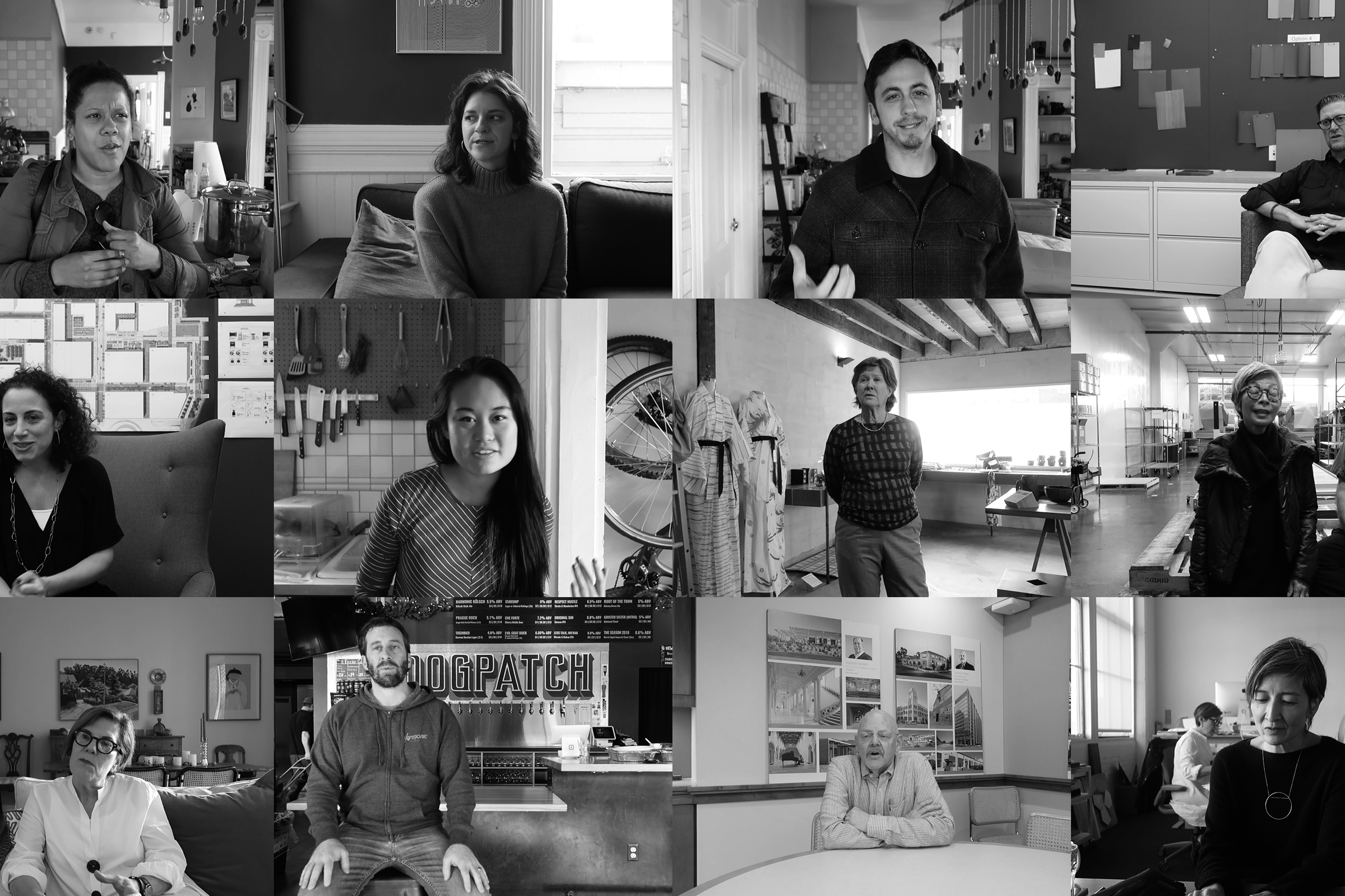
Digbeth
Birmingham’s former industrial heartland is evolving into an enterprising creative neighborhood. Our brief was to create a strong voice and place brand that resonated with this industrious community of proudly individual businesses. The result is a rich typographic identity inspired by the place and people of Digbeth.
What we did
— Community research
— Brand strategy
— Visual identity
— Design & art direction
— Web design
— Content management
— Social media strategy
— Signage & wayfinding
— Brochure design
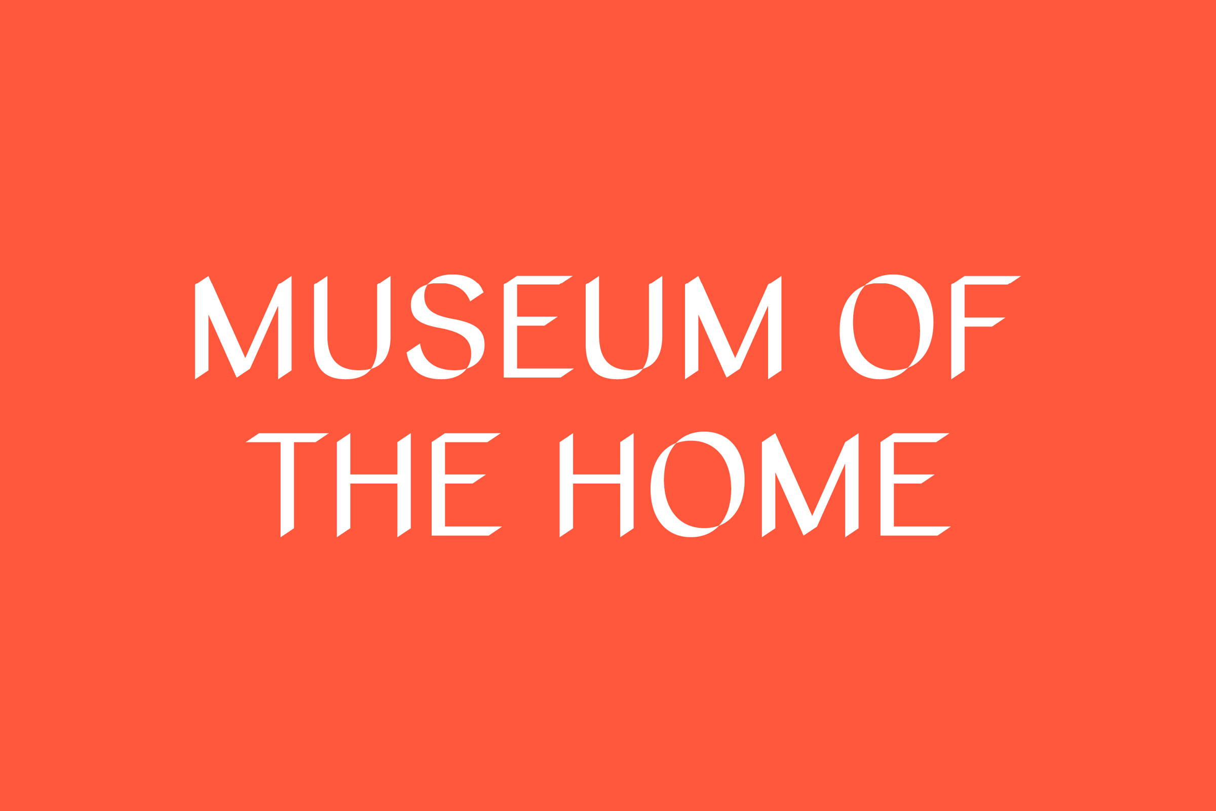
Museum of the home
The Geffrye Museum was undergoing radical redevelopment and rethinking. Looking to engage new audiences, we created a new brand, name and purpose that drives the museum to have an important role in society — to reveal and rethink the ways we live, in order to live better together. To become, the Museum of the Home.
What we did
— Brand strategy
— Visual identity
— Design & art direction
— Signage & wayfinding